Ping Pong 09 ~ but another may be
June 8, 2014
Ping Pong is the show I have been enjoying the most this season. One of the first things people notice are the unusual visual style, so I thought I would address that in a post.
Probably the first thing people notice is that some of the character designs are intentionally “ugly”, or that at times (well, frequently), the character designs morph in some way. I like the fact that Ping Pong character designs intentionally avoid the standard anime designs. Instead we are presented with a startling variety of characters: some with bushy eyebrows, some with faces so deeply wrinkled that you can barely identify the mouth, some with eyes that are tilted so far that they almost become vertical. Everyone’s appearance is horrific in a way, and has an eerie beauty in some other, and that works perfectly with the character studies that are developed throughout the series. Characters are shown from a variety of perspectives. Some views of the characters are unflattering, some are flattering. Nobody is shown completely to be good, or virtuous, just as even the characters that seem at first to be villains are shown to have nobility in unexpected ways. People are alternately selfish and selfless, lazy and ambitious, belligerent and respectful.
The character models (and really all of depicted reality) are frequently shown morphing and warping. I suppose this can be an uncomfortable experience for an unexpecting viewer, but it is used creatively, often to depict emotional states. For example, the following sequence occurs during a match, where a split-screen like technique is used, but the separate frames warp and bubble, seeming to have an impact on the player depicted in the lower frame. It represents the emotional experience of the match suddenly going horribly wrong.
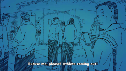
There are other ways that Ping Pong rejects anime visual traditions. The traditional Anime art style uses cel shading, where areas of different colors are used to represent shadows. Even 3D rendered anime typically simulates this technique, but Ping Pong rejects the shading technique almost entirely. Instead the look is more reminiscent of a watercolor and ink drawing. The distinguishing features (including shadows) are all established by the ink drawing, and watercolor pigments just apply flat washes of local color. In the following example, local colors are replaced by a solid blue color across the entire frame. All of the animation is done in line drawing.
Final Thoughts
Ping Pong’s visual style *is* different., but it is far from unsophisticated. It rejects common anime conventions of beauty, and technique, and often looks what would be called “off model” in a typical anime series. I’m by no means stating that typical anime are wrong for attempting to make things pretty. I respect the animators who attempt to create anime in the traditional style, where beautiful (or at least cute) guys and gals sip tea, or battle in giant robots. I also respect the work that Masaaki Yuasa has done throughout his career, and I think Ping Pong is a high point.
I focussed on visual aspects of Yuasa’s style here, but Ping Pong also picks up the recurring theme in Yuasa’s work: humans re-inventing themselves. In many of Yuasa’s works, the main character undergoes re-birth or a significant transformation which gives them another chance to live a meaningful life. Ping Pong is full of these moments.
I greatly enjoy this show, and hope others have the courage to try Ping Pong.


June 8, 2014 at 3:03 pm
I like Ping Pong, but not unreservedly so. I don’t have a problem with the unconventional art, but I’m much less thrilled with the fact that there is just so little actual animation. I realize it’s not a traditional sports anime, but the matches are little more than slideshows – albeit creatively designed ones. There’s something off-putting about watching a story predicated on movement where there is so little action really depicted.
June 8, 2014 at 7:47 pm
Thanks for your comment!
I wouldn’t say there is very little animation, it just gets used in very unusual ways.
For example, in the blue screenshot above, everything (architecture, people …) had to be re-drawn in each key frame, because the entire sequence is shot from the perspective of someone moving through the seen.
Typically a seen like that would not be depicted, or would be shown from a perspective that is stationary. As such, even if the subject has to be redrawn in every keyframe, the background can stay static. That makes it *much* cheaper to produce.
Now you could disagree with the decision to spend the animation budget on scenes like that, instead of on the “action” scenes, but I think the show is well-animated. It just uses animation in an unusual way.